My Role
UX Design
Techniques
User persona, journey mapping, low-fidelity wireframing, mockups
Tools
Pen + Paper, Balsamiq, Adobe XD
Platform
Web
Overview
I was tasked with redesigning a t-shirt e-commerce website, shirtsbymike.com, to make the site look and function better for their customers.
Goals
- Increase t-shirt sales by offering limited but consistent brand themes weaved into all products.
- Provide a design that is easy to recognize among their target audience in order to create a sense of belonging to a greater community.
- Launch a featured t-shirt of the month.
Problems
- Content is outdated and fails to engage the user.
- Their stale content is not engaging and feels irrelevant.
- Unable to highlight a featured t-shirt.
How might we stay relevant and current to meet the needs of our users?
Research
Our Users
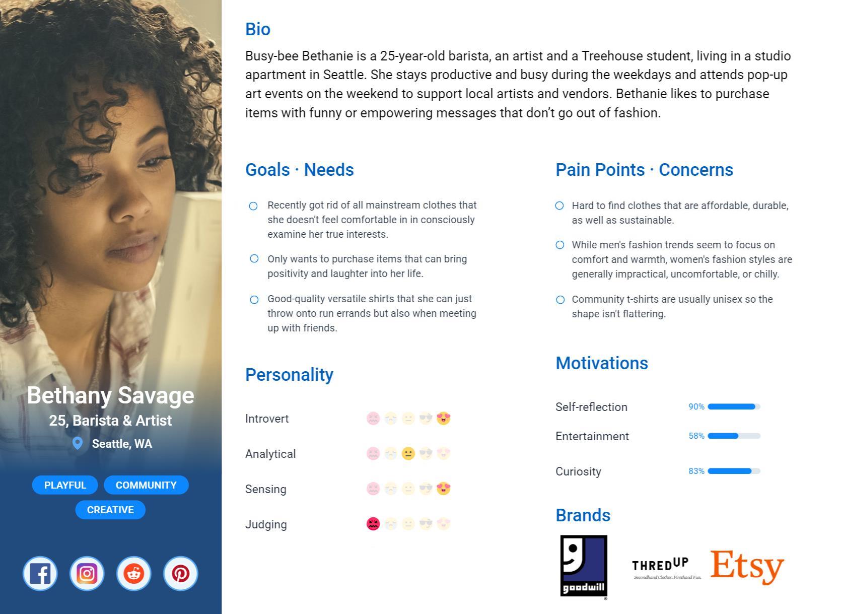
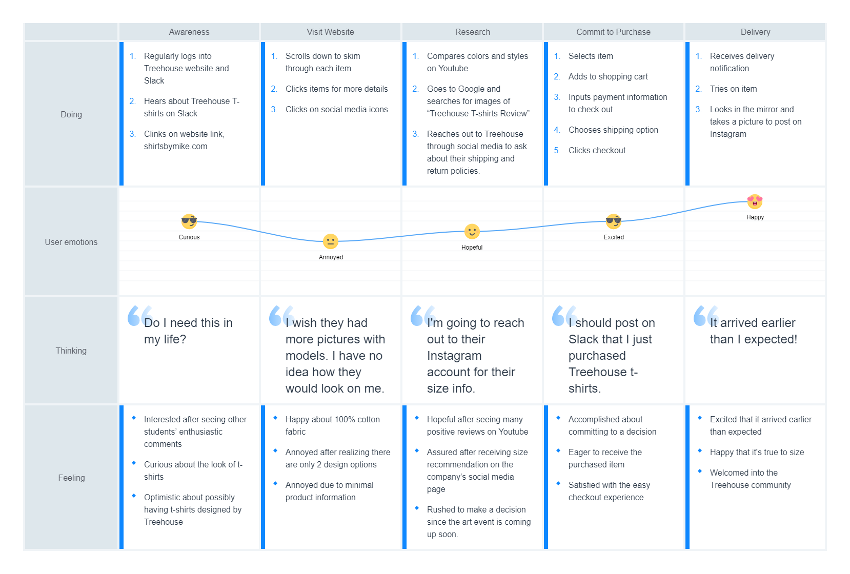
Our users are life-long learners who enjoy practicing self expression and immersing themselves in spontaneous experiences. They value community and exploration within the overall learning experience at Treehouse.
Current Design
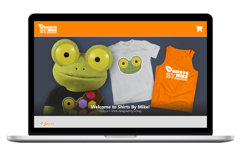
Starting the project, I explored the strengths and weaknesses of the current website.
Strengths
- The responsive and mobile-friendly design
- The dominant color, orange, is a good logical choice since orange is associated with youthful, fun and happy feelings – a great fit for a t-shirt e-commerce shop.
- The large hero image showcasing Mike, the Frog is eye-catching and shows the company’s playful personality.
Weaknesses
- The website’s dramatic text shadows and hard-to-read text color, orange makes the design feel outdated.
- Lack of organic shapes makes the website feel rigid and doesn’t add any playful or fresh look to the design.
- The hero image lacks in picture quality which greatly affects the perceived value of the business.
Competitor Analysis
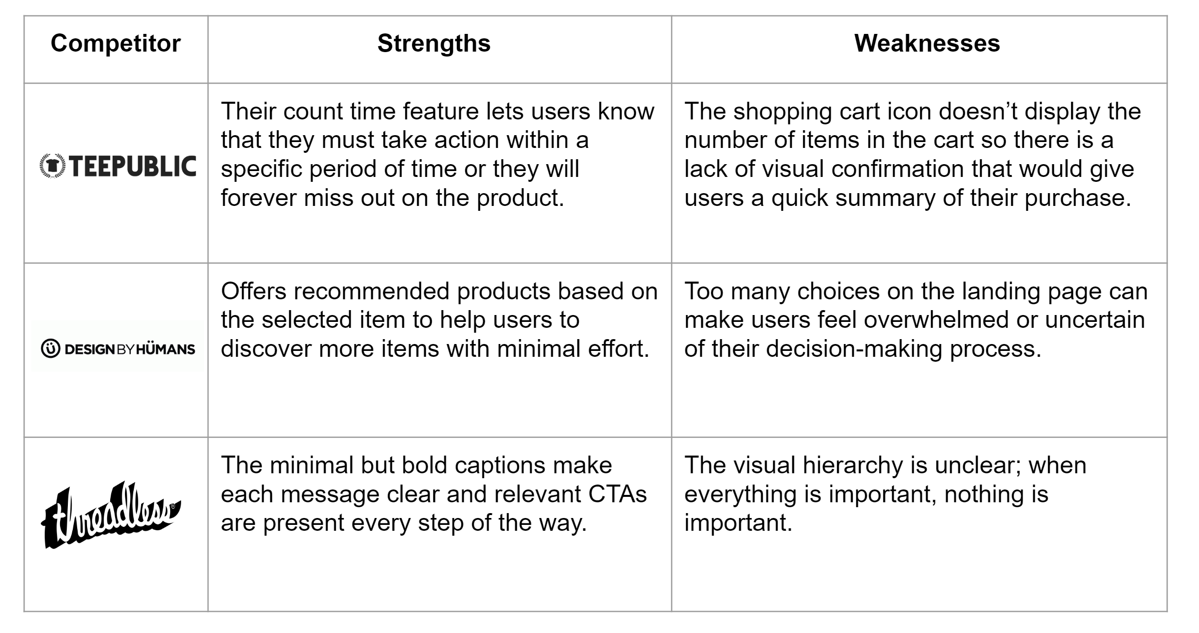
After identifying our strengths and weaknesses, I sought out comparable t-shirt retailers to benchmark shirtsbymike.com
Opportunities:
- Include images that showcase the t-shirts in action to cultivate trust and a relationship with the target audience.
- CTA buttons should contain words that encourage action such as “Buy Now” or “Browse.”
- Include a “Submit Design” feature to encourage engagement and stay relevant with users.
Solution
Sketching
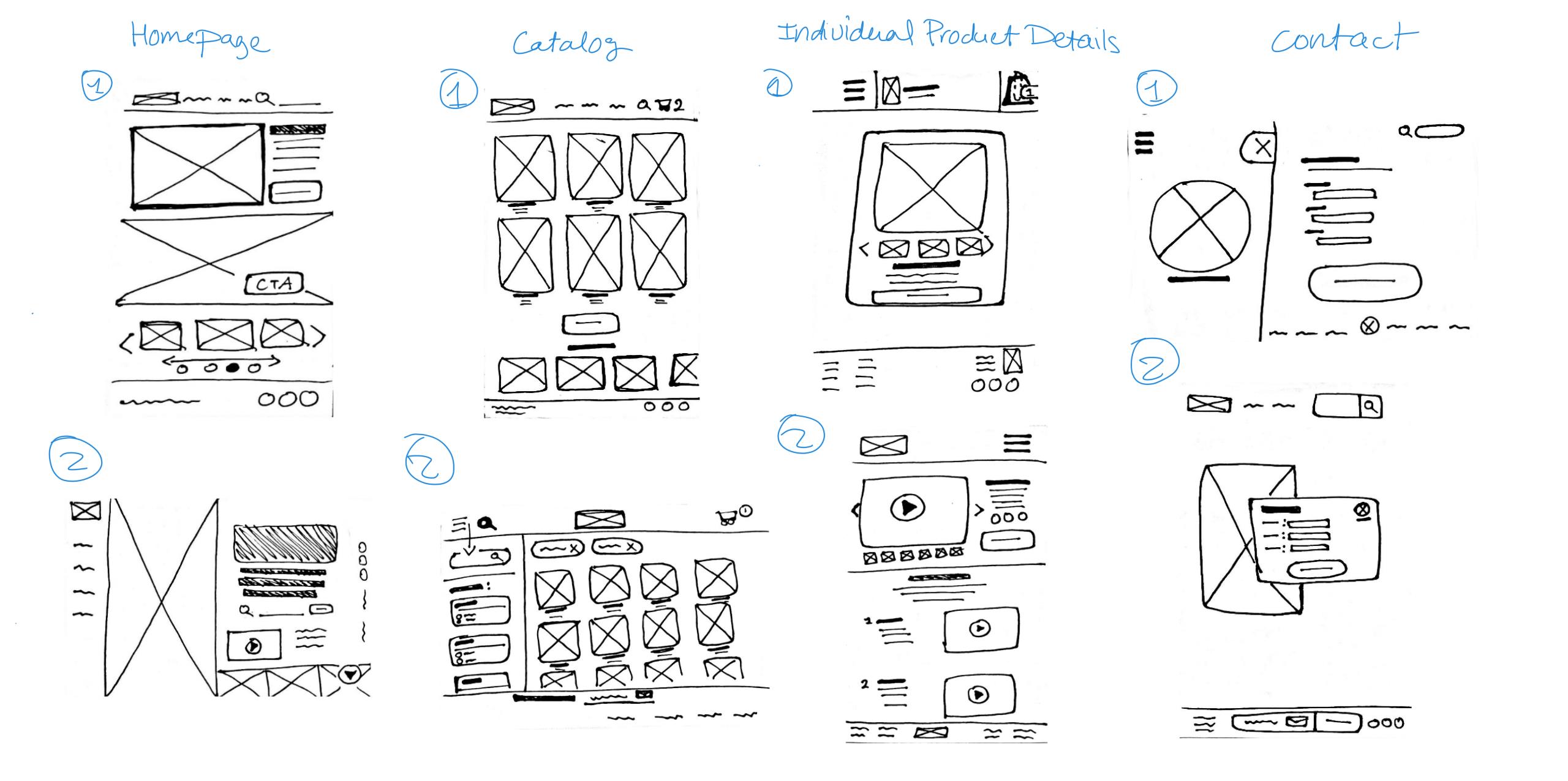
Before moving to Balsamiq to design low-fidelity wireframes, I drew simple sketches to map out the interface and basic information architecture. .
Wireframing
After sketching, I realized that the information on the catalog page can feel overwhelming for first time visitors. To allow users to compare and save items while they continue to shop, I added a wish-list heart icon function to provide an easy-to-find feature for customers who want to save items for later. I also added a review section after researching how to best impact users’ purchasing decisions; according to Spiegel Research Centre (2017), 95% of online users read reviews before making a purchase and a study by BrightLocal (2014) found that up to 88% of online users trust reviews as much as they do personal recommendations.
Moodboard
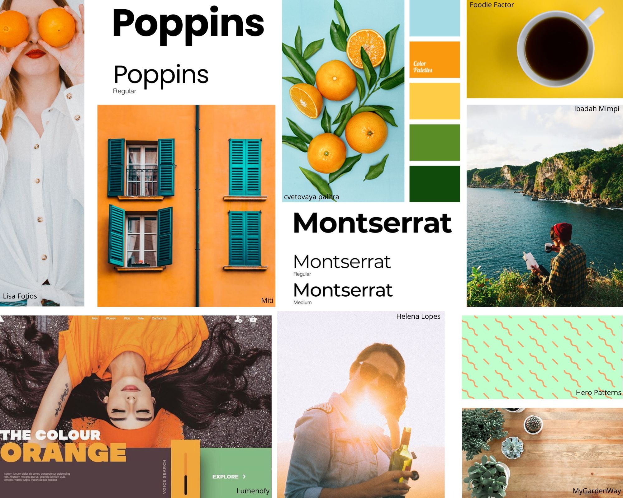
I then created a moodboard to experiment with a color palette & fonts and to find the right mood and style.
Final Redesign
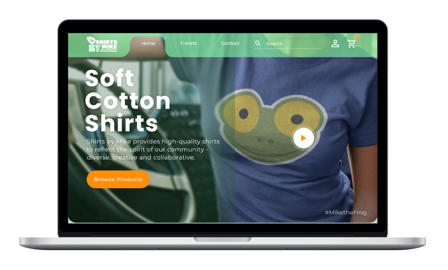
For the redesign, I focused on three design principles:
- Simple & Efficient: I kept the landing page clean and simple with prominent CTA buttons to limit the number of choices; thus, lessening the time and effort it takes to make a decision.
- Relevant & Useful: I replaced the original hero image with a big background video to promote audience engagement. The video not only brings the brand to life but the motion incites users to pause and consider its relevance to them.
- Color Palette & Imagery: I chose to keep the complementary color palette of green & orange but introduced coral & blue to further solidify the idea of modern youthfulness. In order to help our target audience feel more like they are part of a community, I included pictures of people — whom I chose based on my user persona — wearing the ShirtsbyMike.
Learnings
Designing a mockup for the t-shirt retailer gave me the opportunity to analyze and create as well as uncovered a vision of what UX is about. It’s not just about the design and colors of a website but it also works hand-in-hand with marketing. If the primary goal of marketing is customer engagement and retention then UX is about knowing who your market is, researching what is important to them, figuring out why it’s important to them, and designing accordingly, which leads to more conversions.

